

branding, UI design, print, social media, icon design · Kitchen Wise | Closet Wise · 2026
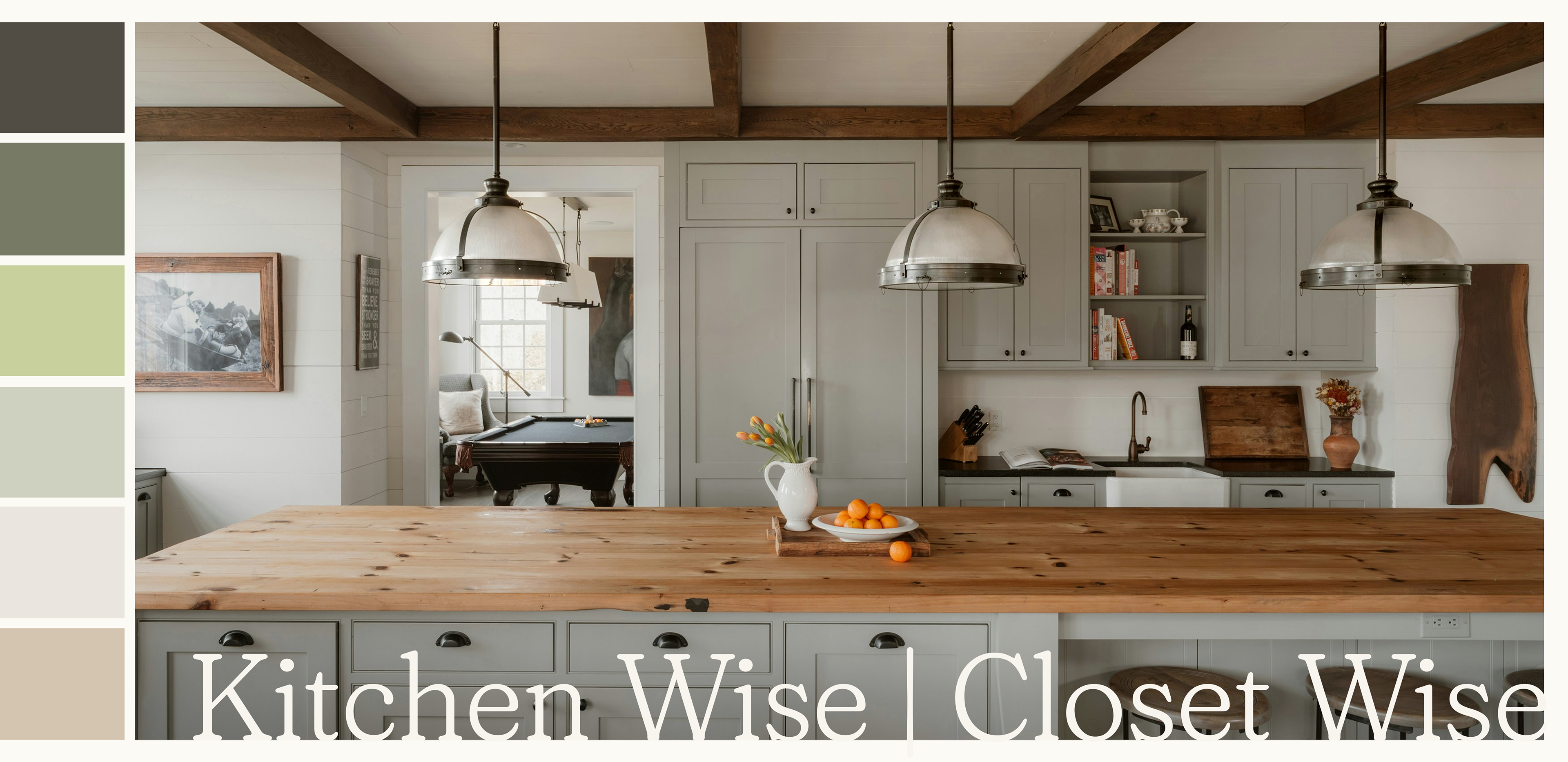
Kitchen Wise | Closet Wise was in need of a refresh. This brand’s services involve designing and installing organization systems in home spaces including kitchens, closets, pantries, garages, and more. The brand colors involved a dark grey and a memorable electric green, which certainly stood out, but lacked the calming elegance the brand needed to step up against its competitors.
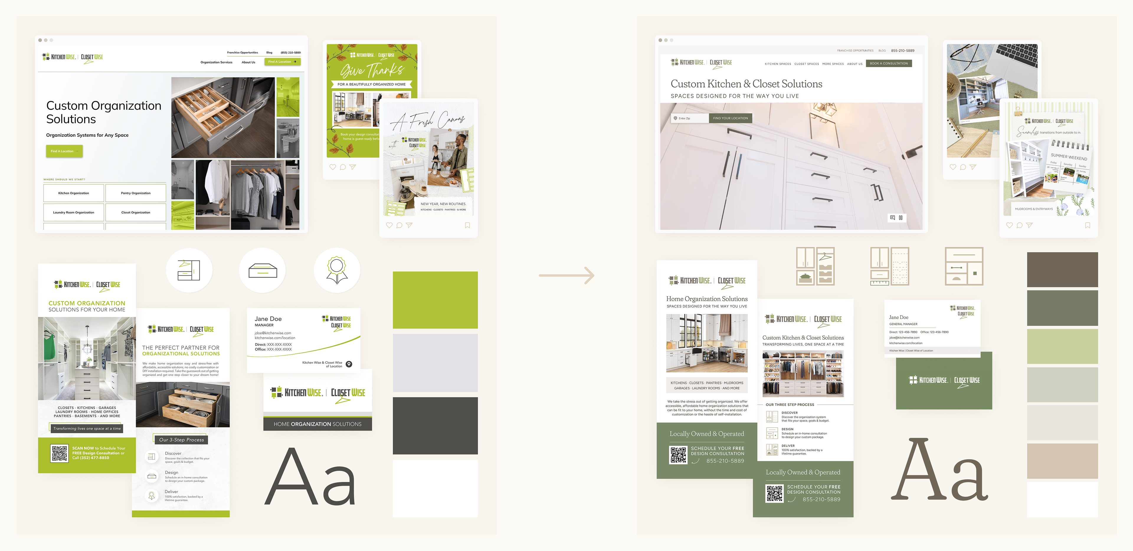
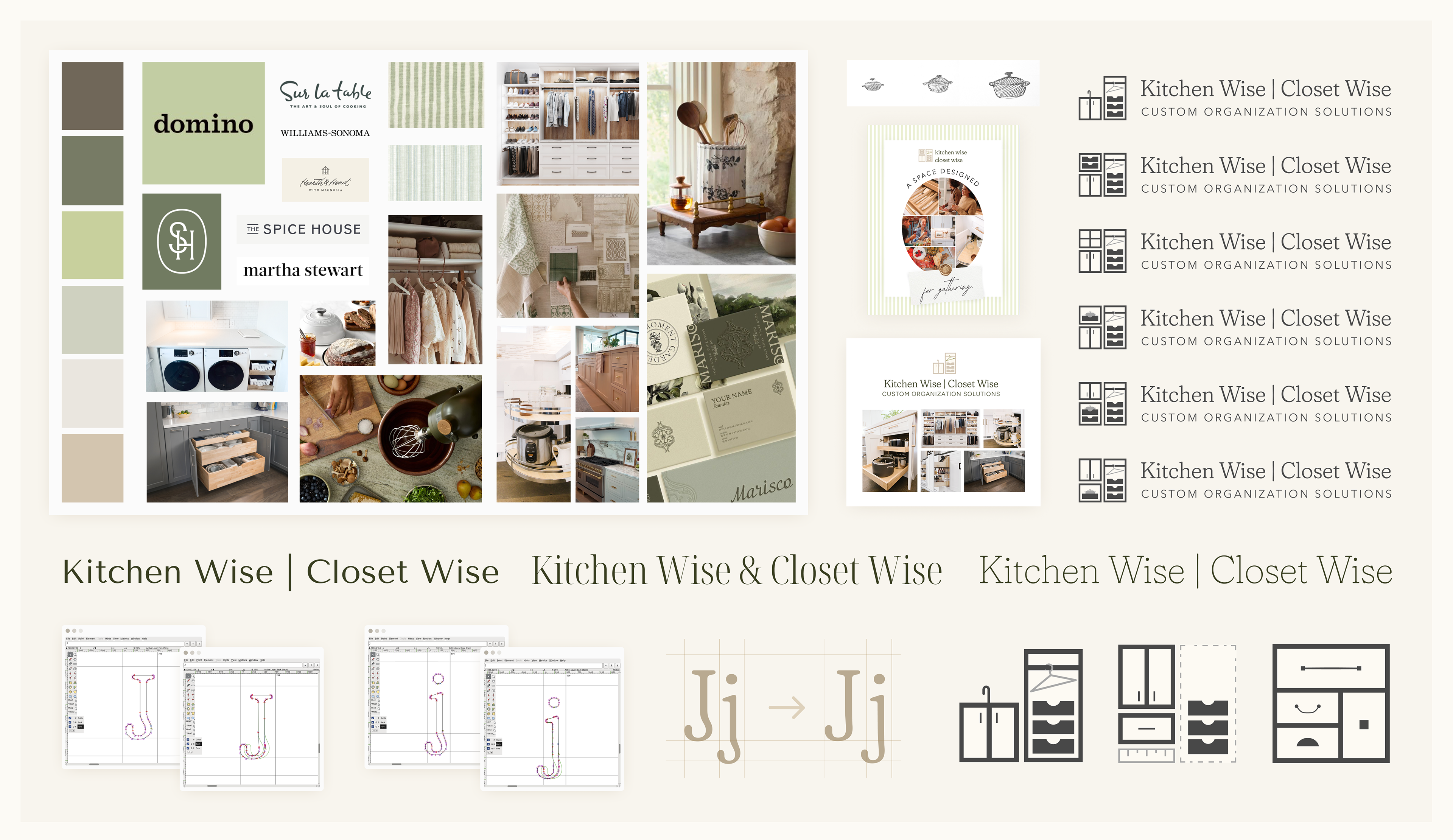
Our task was to refresh the brand and rework the website to better suit the franchise owner’s needs. Working with our VP of Marketing, I started by creating a few moodboards, decided on color scheme and art direction for imagery, picked out a typeface, and worked through some logo iterations.
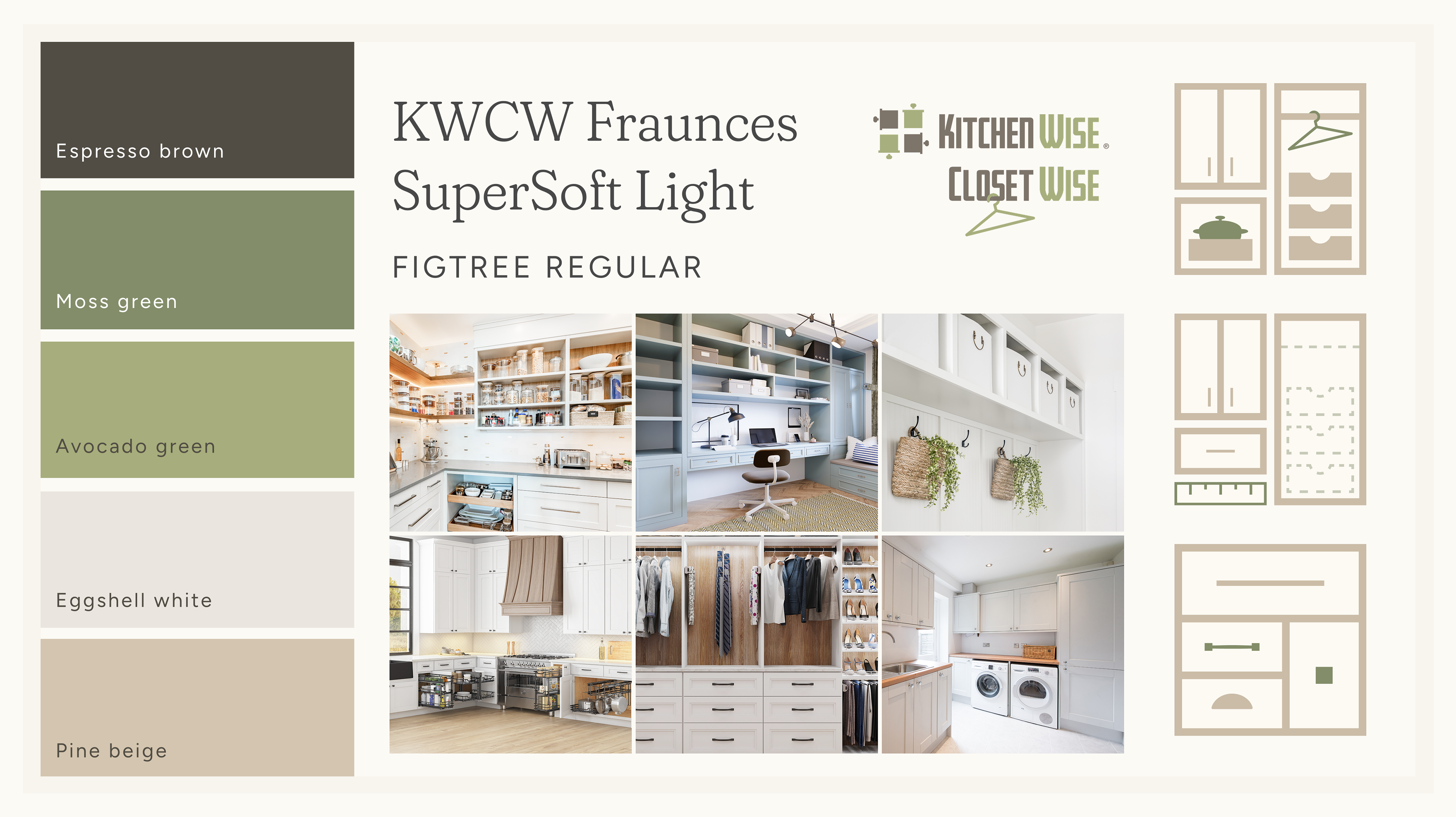
We took the electric green and toned it down to a calmer sage and a soft dark green; the dark gray turned into a heartier brown. We incorporated a soft beige, pulled from the light pine tone of the drawer inserts used for installations, which we are using in our icon set (see here).
The logo redesign was dropped for budgeting reasons, so we decided to 1) just change the colors of the original logo to the new color palette, and 2) repurpose the logo mark I created into the first of the icon set. To elevate the brand, I chose a gentle serif typeface, Fraunces SuperSoft Light. This typeface has a good deal of wonkiness built into it, which I felt might be too alienating for our franchisee demographic, so I went in and toned down the wonk of some glyphs with the open source program FontForge. I had no prior type design experience, so this was a little adventure for me!
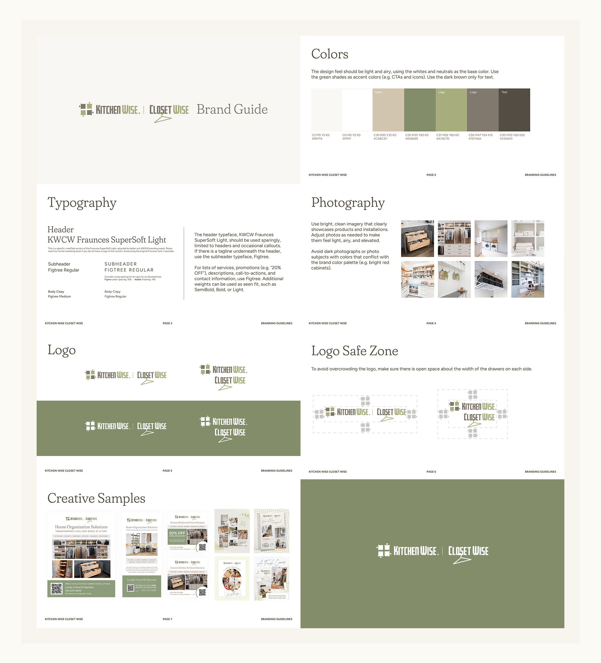
The franchisees were very receptive to the rebrand. One owner said that after using materials with the intense electric green for years, Kitchen Wise | Closet Wise finally had the calming "Ahhh..." feel to it, which is just what this brand needs in the home services space.
UI DESIGN
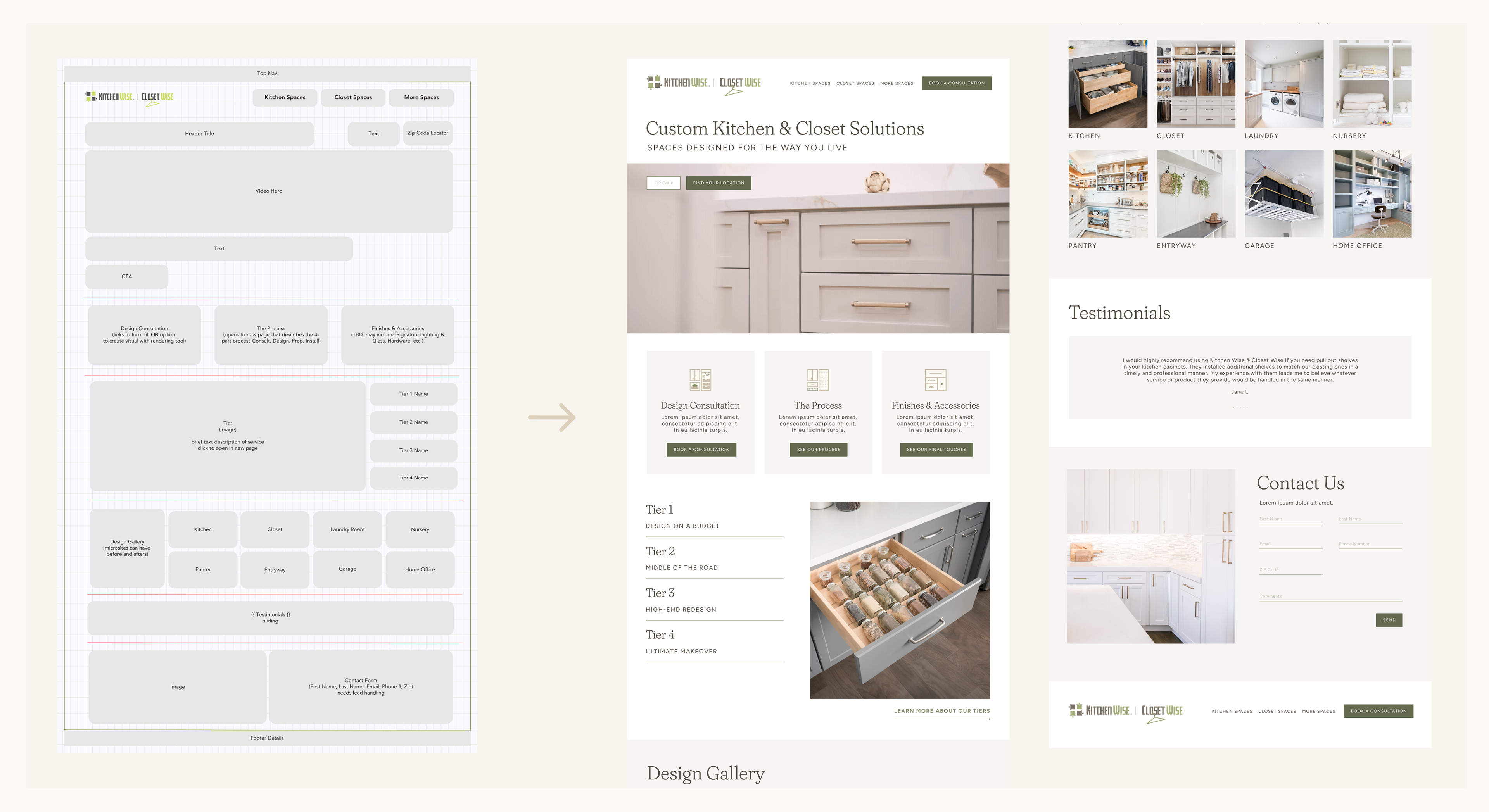
Our VP of Marketing had created a wireframe for the landing page based on the particular input and requests of the franchise owners. The aim was, first and foremost, to create a website that aligned exactly with the owner's needs and vision for their brand, and second, to ensure that it was optimized for SEO purposes, chiefly through our digital marketing vendor partner, who developed the site.
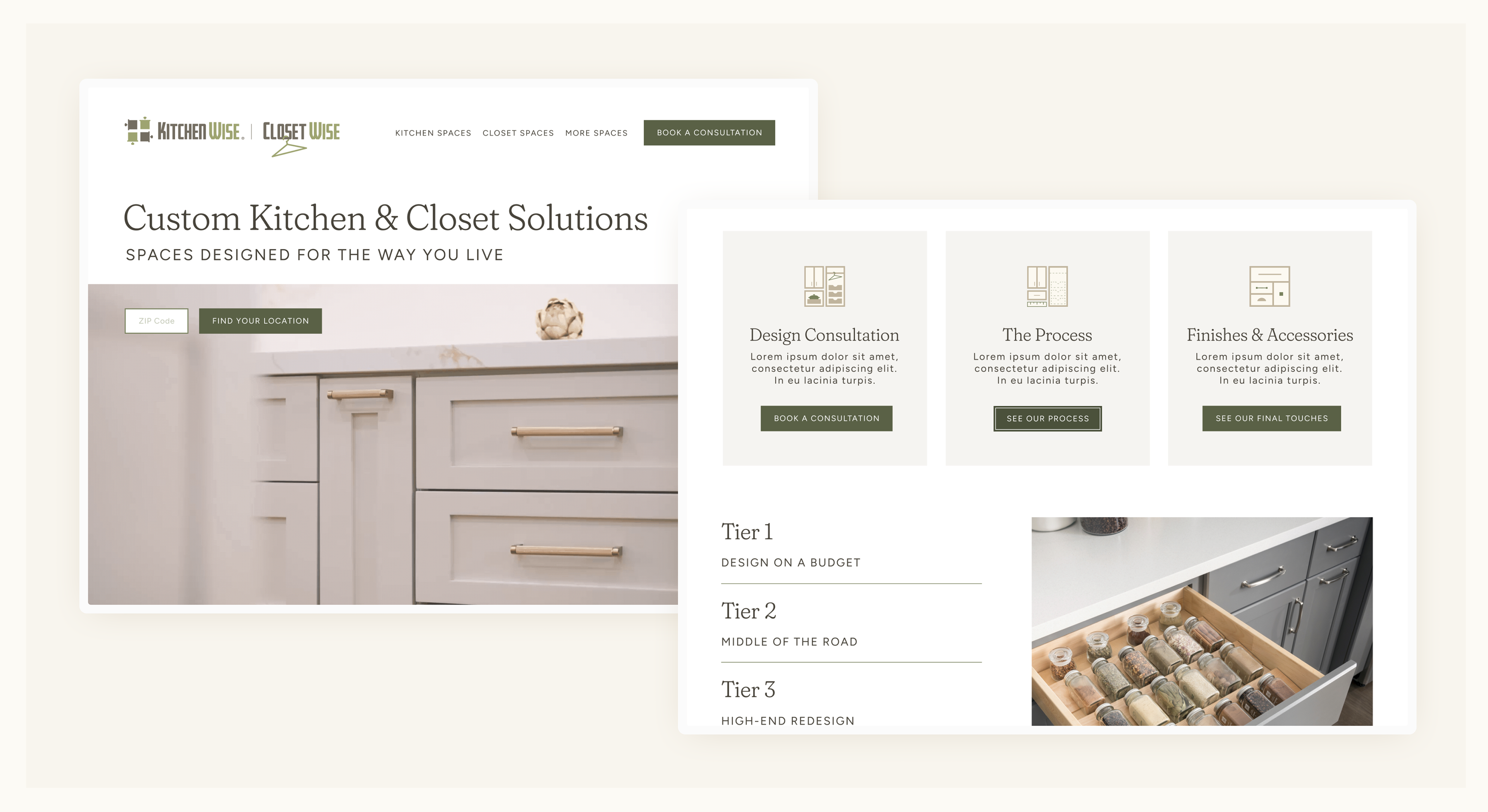
I took her wireframe and designed a working prototype in Figma. With the help of our vendor partner, we made accessibility adjustments to the design to ensure it was WCAG-compliant.
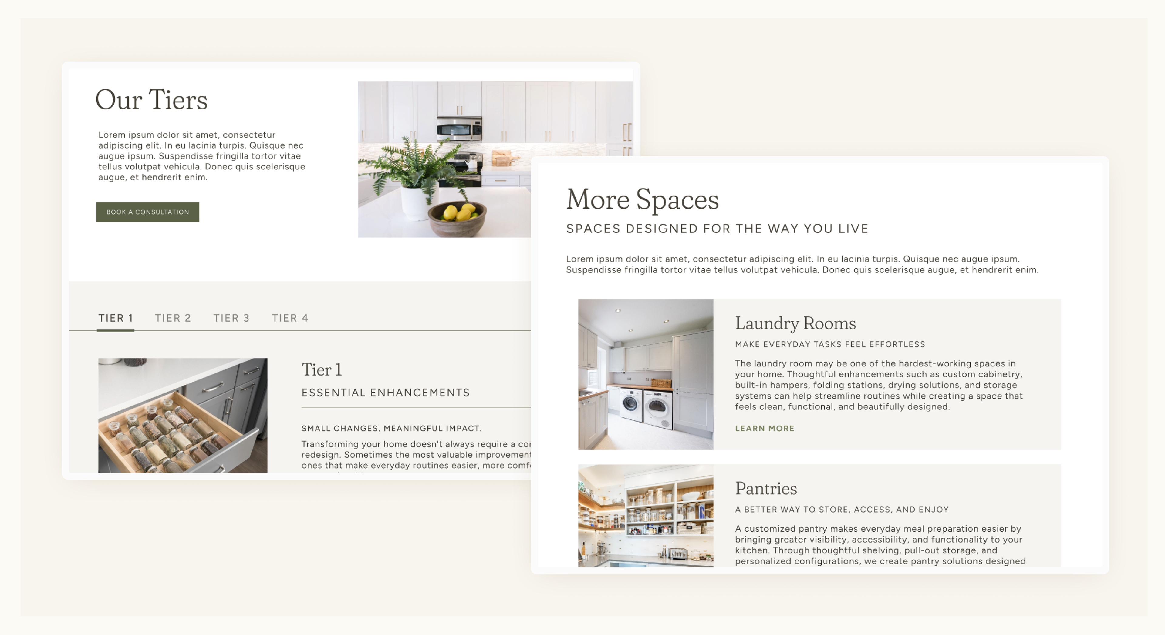
I also designed side pages, including a page on tier information and on other spaces in addition to kitchens and closets. These pages also serve to optimize the site's SEO.
I am looking forward to seeing the performance of this site, and how much it improves from the site design before. So far, our franchise owners are ecstatic about it and seem very satisfied, so I am happy with the work we did here!